Five charts to keep an eye on regarding the global economy
Key points
- Whether a recession is imminent or not in the US, and more broadly globally, is critically important in terms of whether a major bear market in shares is on the way.
- Five key global charts to watch in getting a handle on whether a major downturn is on the way are: global business conditions PMIs; global inflation; the US yield curve; the US dollar; and global trade growth.
- While risks have increased – particularly in the US where the economic cycle is more advanced and around the $US and emerging countries and global trade – our assessment remains that a major US/global downturn still remains a way off.
- Which supports our assessment that notwithstanding periodic corrections – including through the seasonally weak period for share markets that we are now in – the broad trend in share markets is likely to remain up.
Introduction
There is lots of talk about when the next major economic downturn will be. This interest seems to have been particularly noticeable over the last week or so given the ten-year anniversary of the failure of Lehman Brothers which helped usher in the worst phase of the Global Financial Crisis (GFC), which naturally prompted the question of when the next one will be. But it’s also been given impetus as the current US bull market and economic expansion are approaching record territory in terms of duration and given the threats from a US-driven trade war.
The historical experience indicates that share market downturns are much deeper and longer when there is a recession, particularly in the US economy. So, whether a recession is imminent or not in the US, and more broadly globally, is critically important in terms of whether a major bear market is on the way. Of course, no one really knows for sure (despite many claiming they do!). But certain indicators help provide some guidance as to the risks. This note looks at five charts to monitor in terms of the state of the global economy.
Chart #1 – Global business conditions PMI
Global Purchasing Managers Indexes (PMIs), which are surveys of purchasing managers at businesses in most major countries, provide an excellent and timely guide to the state of the global economy. As can be seen in the next chart, while they are down from their peaks of earlier this year they remain very strong indicating that global growth remains strong. This is particularly the case in the US. Quite clearly a sharp downturn, as occurred going into the GFC, would be a concern for global growth but so far so good.
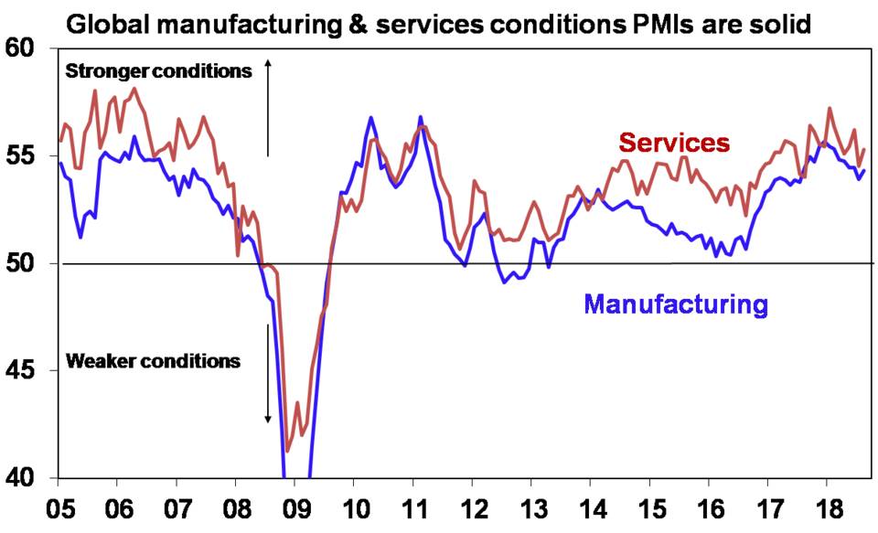
Chart 2 – Global inflation
Most major economic downturns are preceded by a rise in inflation to above central bank targets resulting in aggressive monetary tightening. The period prior to the GFC was something of an exception in terms of core inflation, ie inflation excluding food and energy. But average headline inflation rose to around 4% across the US, the Eurozone and Japan at the time as energy prices surged and the run up to the GFC was associated with tight monetary policy in the US and Europe (where the focus at the time was on headline inflation).
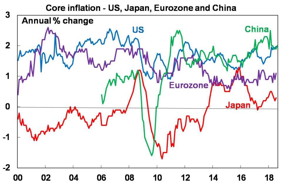
At present, core inflation in major global economies is benign. In the US core inflation is around 2%, which is the Fed’s target and headline inflation is falling. Inflation in China is also around 2%, which is below the Government’s 3% target/forecast. And inflation in the Eurozone and Japan, whether headline or core, is below both the European Central Bank’s and the Bank of Japan’s 2% targets. While a lack of spare capacity in the US means that the Fed will continue raising interest rates to more normal levels, with inflation around target (and other signs of inflation pressure like wages growth rising only slowly) it can continue to be gradual in doing so. Meanwhile, with inflation below target in in Europe, Japan and China, monetary tightening by their central banks is a long way off. Obviously, a clearer upswing in core inflation would be a warning sign of more aggressive monetary tightening being on the way, which would then threaten economic growth.
Chart 3 – The US yield curve
The yield curve is a good guide to the stance of monetary policy. When short-term interest rates are low relative to long-term rates businesses can borrow short and lend (or invest) long and this grows the economy. But it’s not so good when short rates are above long rates – or the curve is inverted. And an inverted US yield curve has preceded US recessions. So, when it’s heading in this direction some start to worry. As a result, it’s worth keeping an eye on and it’s our third chart. But there are several complications to allow for.
First, there are several versions of the yield curve. The traditional yield curve based on the gap between 10-year bond yields and the Fed Funds rate has flattened but only to 1.2%. Moreover, a shorter yield curve based on the gap between 2-year bond yields and the Fed Funds rate predicted past recessions like the longer yield curve but has actually been steepening lately which is positive. So our chart includes both yield curves. Both are yet to go negative as occurred prior to the last three US recessions.
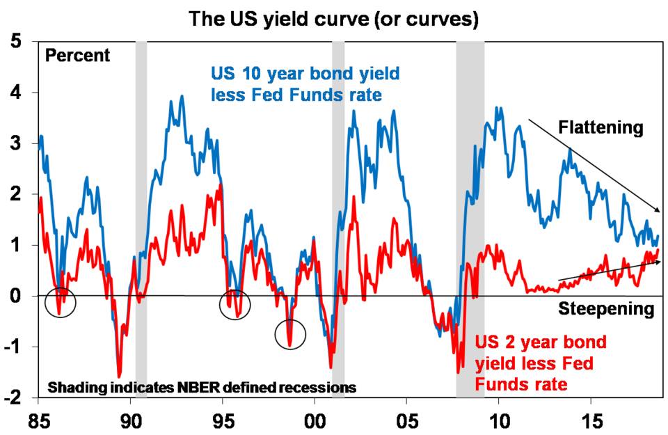
But there are several other things to allow for. The yield curve can give false signals (circled on the chart) and the lags from an inverted curve to a recession can be around 15 months.
Various factors may be flattening the traditional yield curve unrelated to economic growth expectations including low German and Japanese bond yields holding down US yields and higher levels of investor demand for bonds post the GFC as they have proven to be a good diversifier to shares in times of crisis.
On top of all this, a flattening yield curve caused by rising short-term rates and falling long term-rates is more negative than a flattening when both short and long-term rates go up like recently.
So all up the yield curve is worth keeping an eye on but both its long term and short term versions really need to go negative before getting too concerned. So far so good. Of course, it’s worth keeping an eye on other measures of US monetary tightness as well – for example past US recessions have been preceded by the Fed Funds rates being well above inflation and nominal economic growth whereas it’s still a long way from either now.
Chart 4 – The US dollar
Moves in most currencies are usually only really of relevance for the country that the currency belongs to. The US dollar is a clear exception to this mainly because debt is often denominated in US dollars. In particular, emerging countries tend to have a lot of US dollar denominated debt so when the $US falls in value versus their own currency, servicing that debt gets cheaper but when the $US goes up in value, servicing that debt gets more expensive.

This has been the case lately with the rising US dollar against most currencies including emerging market currencies as shown in our fourth chart, adding to problems in various emerging countries. Further strong gains in the US dollar as the Fed continues to hike risks worsening emerging market problems and the risks that this poses to global growth (as the emerging world is around 60% of global GDP). By contrast if the US dollar moderates, the pressure on emerging countries is likely to recede.
Chart 5 – World trade growth
In recent times there has been much debate as to whether the era of globalisation is coming to an end resulting in a peak in world trade. This could be for somewhat benign reasons as services become an ever-greater share of economic activity and manufacturing becomes less labour dependent. But it could also be due to rising protectionism with US policies under Trump a big threat. It’s early days so far with only about 12% of US imports being subject to increased tariffs for an average tariff increase across all US imports of just 1.6% (after the latest tranche is implemented). This is a long way from 1930 that saw all US imports subject to a 20% tariff hike and other countries do the same. While we still see a negotiated solution, it may not come till after the US mid-term elections. Global trade growth has picked up over the last two years but its recently started to slow a bit. It’s too early for this year’s trade conflict to show up in trade data but it’s worth watching this chart as slower global trade growth would pose a threat to global economic growth.

Concluding comments
On balance these indicators suggest the outlook remains okay. Perhaps the greatest near-term risks are around the US dollar and Trump’s trade war. Beyond this, cyclical indications are still okay. And while we haven’t had room to fit it in here the signs of cyclical excess that normally precede major economic downturns – eg, very strong wages growth and a high level of cyclical spending (consumer durables, housing and investment) as a share of GDP – aren’t particularly evident in the US and are a long way from being evident in other major countries.


Leave a Reply
Want to join the discussion?Feel free to contribute!